Examples of using CSS text shadow. CSS: Several techniques for different stroke effects on elements Css text shadow examples
Even the greenest designer knows how to make shadows in Photoshop. Shadows add dimension to the design and are now very popular. Shadows for texts, menu items and headings are no exception. Suffice it to recall the design of interfaces from apple
It will be useful to have skills in working with text shadows in your arsenal of techniques.
Task
Make a shadow for text using CSS, without using images. What will we achieve with this?
- flexibility - no images required, text is easy to change
- speed - fewer images - less page weight, fewer calls to the server
- SEO - text is optimized better than pictures, and is more reliable than using the technique of replacing text with a picture
Text shadows for normal browsers
Normal browsers include all modern browsers that keep more or less in step with W3C recommendations. In this case, these browsers understand the CSS3 text-shadow property, which was recommended back in 2003.
So, here is a list of browsers that support the text-shadow property:
- Safari 3.1 (Mac/Win) - supports, does not support multiple shadows
- Safari 4 (Mac/Win) - fully supported
- Opera 9.5+ (Mac/Win/Lin) - fully supports
- Firefox 3.1/3.5 (Mac/Win/Lin) - fully supports
- Google Chrome 2 (Win) - fully supported
- Shiira (Mac) - supports, does not support multiple shadows
- Konqueror (Lin/Mac/Win) - fully supports
- iCab (Mac) - supports, does not support multiple shadows
- Safari on iPhone - supported, multiple shadows not supported
- Nokia Symbian-Smartphones (Series 60) - supports
- Opera Mini 4.1 - supports, does not support shadow blur
For these browsers, one line of CSS is enough to shadow text:
H1 ( text-shadow: 0px 1px 3px #000; )
We get this fancy headline:
You can achieve a variety of interesting effects with text-shadow.
Blurred text
H1 ( color: #fff; background: #666; text-shadow: 0px 0px 3px #fff; )
Duplicate text
H1 ( text-shadow: 0px 20px #000; )
Multiple shadows allow you to achieve several more effects:
Recessed text
H1 ( background: #ccc; color: #ccc; text-shadow: -1px -1px #666, 1px 1px #FFF; font-family: serif; )
Raised text
H1 ( background: #999; color: #999; text-shadow: 1px 1px 3px #666, -1px -1px 3px #FFF, 1px 1px #666, -1px -1px #FFF; font-family: serif; )
(IE will not allow you to enjoy the beauty here, because it does not support text-shadow). You can come up with a lot of different effects using text-shadow, the only practical limitation is your imagination.
Now about the sad thing - what to do with everyone’s “favorite” IE?
Text shadows in IE
Although IE up to version 8 does not understand text-shadow, it has plenty of its own “bells and whistles”. In particular, there is a dropShadow() filter for creating shadows. For shadows to appear, the element must have a layout set. You can install in several ways:
- by setting the element properties: block + height() or width())
- giving the element : absolute
- by specifying: left/right
- setting zoom: 1
H1 ( filter:progid:DXImageTransform.Microsoft.DropShadow(color="#666666",offX=2,offY=2,positive="true"); zoom: 1; )
It seemed that one could shout “Hurray!!!” and enjoy life, but look how this filter works in reality:
This is how the text will appear if you apply the dropShadow filter to it
For those who do not understand, here are the disadvantages of this filter:
- the shadow looks terrible: angular, no smooth transition into the background with translucency
- font style is distorted
- the shadow is practically impossible to adjust (you can only control the position of the shadow) - this can be partially circumvented by using the shadow filter instead of dropShadow, but the critical first two drawbacks remain
- the mandatory presence of a layout somewhat limits the developer
This result is not acceptable in real projects. It is unclear who and how took over such work from the developers.
Kilian Valkhof suggested using shadow emulation:
- do not apply the filter directly to the text
- use a combination of glow and blur filters instead of dropShadow and shadow
This will avoid text distortion and make the shadow more flexible.
Test headerТестовый заголовок
H1 ( text-shadow: 3px 3px 3px #cccccc; position: relative; zoom: 1; color: #000; ) h1 span ( position: absolute; left: -3px; top: -3px; z-index: -1; filter: progid:DXImageTransform.Microsoft.Glow(Color=#cccccc,Strength=1) progid:DXImageTransform.Microsoft.blur(pixelradius=3, enabled="true") ; zoom: 1; )
But even with this approach, there are still a number of disadvantages:
- non-semantic code is an extra element, and even with duplication of text it will not have the best effect on the logical structure of the content and SEO optimization. This problem can be solved using javascript, which will insert an additional element for IE when the page loads
- does not correspond to the display in other browsers (which understand text-shadow) - filters allow you to emulate a shadow with minimal settings. It is not always possible to achieve shadow similarity with other browsers
- less flexibility - filters will not provide all the capabilities of text-shadow, for example, it will not be possible to implement multiple shadows
To create shadows for IE, you can use javascript (not the first time javascript has saved the day)
Text shadows using javascript
From the scripts that I tested, I chose the jquery plugin "Drop Shadow". Its advantages:
- emulates shadows by inserting multiple containers, i.e. without using filters for IE. This makes it possible to make shadows in IE as similar as possible to other browsers + no need to worry about layout for IE
- creates shadows not only for IE, which can sometimes be useful
- the script is lightweight - 4Kb (if you remove comments from the code), and if you apply compression, it will be even less. There are requirements in writing a script - the presence of the jquery.dimensions.js script, but I still don’t understand why it is needed. Shadows are created, deleted, defined by id and without it.
- simple and clear to use
- You can emulate multiple shadows with some success
Flaws:
- you cannot initialize a script by element id
- if the element is given a background, the shadow will be created not for the text, but for the element as a whole
- Mandatory inclusion of the jquery library (which is more than 50Kb). But the popularity of jquery practically eliminates this drawback
- According to the script description, the connection of jquery.dimensions.js (another 2Kb) is also required. But I don’t understand why this library is needed, everything seems to work fine without it
Using the Drop Shadow plugin
Syntax:
JQuery(selector).dropShadow(options); // creating a shadow on the element jQuery(selector).redrawShadow(); // redrawing the shadow jQuery(selector).removeShadow(); // removing the shadow jQuery(selector).shadowId(); // returns the id of the element's shadow
Left: [integer] (default = 4) top: [integer] (default = 4) blur: [integer] (default = 2) opacity: [fractional number] (default = 0.5) color: [string] (default = "black") swap: [boolean] (default = false)
The left and top parameters are the coordinates of the beginning of the shadow relative to the upper left corner of the label (or object). Positive values move the shadow to the right and down, negative values move the shadow to the left and up.
The CSS text-shadow property is responsible for setting the shadow of the text. Very similar to the box-shadow property.
CSS text-shadow syntax
text-shadow : X Y R color ;
- X - shift of the shadow relative to the text along the X axis (most often set in px pixels);
- Y - shift of the shadow relative to the text along the Y axis (most often set in px pixels);
- R - shadow radius (most often specified in px pixels);
- color - color (can be specified in any format, see html color names)
The text-shadow syntax allows multiple shadows to be specified, separated by commas. For example
text-shadow : X1 Y1 R1 color1 , X2 Y2 R2 color2 , ...;
The shadow priority (which is higher, which is lower) depends on the specific CSS version. In CSS3, the first shadow in the list is placed at the very top, the last in the list is placed at the very bottom. In CSS2 it's the opposite.
Examples: how to make a shadow for text in html
Example No. 1. Simple shadow for text in html
Below is the simplest example with a text shadow. Here we have applied both offsets (X and Y) and also made a blur radius.
Текст с тенью
Текст с тенью
Пример №2. Фиксированная или жесткая тень у текста в html
Ниже представлены два примера. Тень в обоих случаях одинаковая (фиксированная), т.е. без размытия. Обратите внимание, какой эффект создается, если текст будет на черном фоне.
Фиксированная или жесткая теньФиксированная или жесткая тень с фоном
На странице преобразуется в следующее
Фиксированная или жесткая тень
Фиксированная или жесткая тень с фоном
Пример №3. Двойная тень у текста в html
Двойная тень
На странице преобразуется в следующее
Двойная тень
Пример №4. Вдавленные буквы у текста в html
Вдавленные буквы - вариант 1Вдавленные буквы - вариант 2
На странице преобразуется в следующее
Вдавленные буквы - вариант 1
Вдавленные буквы - вариант 2
Пример №5. Вдавленные буквы у текста в html
Небольшой 3D текст
На странице преобразуется в следующее
Небольшой 3D текст
Для обращения к margin из JavaScript нужно писать следующую конструкцию:
document.getElementById("elementID").style.margin ="VALUE "
Влад Мержевич
Одно время на текст с тенью была определённая мода и подобный эффект можно было встретить практически на любом сайте. В графическом редакторе тень добавляется просто, выглядит отлично, вот текст с тенью и пихали на веб-страницы независимо от стиля сайта и чувства меры дизайнера. Когда же большинство браузеров стало дружно поддерживать стилевое свойство text-shadow , мода уже прошла и теперь текст с тенью встречается довольно редко. Впрочем у text-shadow есть ряд других неявных способов применения, о которых мало кто подозревает. С помощью этого свойства можно делать контурный текст, «выдавливать» его, создавать свечение, размытие и многое другое.
Использование text-shadow
В качестве значений пишется четыре параметра: цвет тени, смещение по горизонтали и вертикали и радиус размытия тени (рис. 1).
Рис. 1. Параметры text-shadow
Цвет допускается писать в начале или в конце всех параметров в любом подходящем формате CSS. Так что можно сделать и полупрозрачную тень через формат rgba. Положительные значения смещения «отбрасывают» тень вправо и вниз, а отрицательные, соответственно, влево и вверх. Чтобы тень была вокруг текста, достаточно задать нулевые значения смещения. Радиус размытия устанавливает, насколько тень будет резкой. Чем больше радиус размытия, тем мягче выглядит тень.
Большим плюсом text-shadow является возможность добавлять сразу несколько разных теней, перечисляя их параметры через запятую. Эта особенность, в основном, и позволяет делать разные эффекты.
К сожалению, IE до версии 10.0 не поддерживает text-shadow , так что в этом браузере мы никаких красивостей не увидим.
Контурный текст характерен тем, что каждая буква обводится линией, цвет которой отличается от цвета текста (рис. 2). Лучше всего этот эффект смотрится с рубленым шрифтом большого размера, например, заголовков. Для основного текста применение контура лишь ухудшает читабельность.
Рис. 2. Контурный текст
Контур можно создать двумя методами. В первом методе устанавливаем нулевое смещение тени и небольшой радиус её размытия, буквально, 1-2 пиксела (пример 1). Повышение значения размытия превращает контур в свечение вокруг текста, а это уже другой эффект.
Пример 1. Контурный текст
Outline text
The contour made by this method is shown in Fig. 1. The outline turns out to be slightly blurred, so for those who want to get a clear line, the second method is intended. It consists of using four sharp shadows of the same color, they are shifted to different angles by one pixel (example 2).
Example 2. Four shadows for the outline
HTML5 CSS3 IE 9 IE 10+ Cr Op Sa Fx
Outline text
The appearance of such a contour is shown in Fig. 3. It is noticeable that the contour is more expressive.
Rice. 3. Contour with four shadows
To add the 3D text effect shown in Fig. 4, several shadows are applied simultaneously, which are shifted relative to each other by one pixel horizontally and vertically.

Rice. 4. 3D text
Personally, this type of text reminds me of retro style lettering and, again, it is best suited for headings, rather than the body of a web page.
The number of shadows depends on how much you want to “pull” the text forward. A larger number increases the “depth” of the letters, a smaller number, on the contrary, reduces the three-dimensionality. Example 3 uses five shadows of the same color.
Example 3: Shadow to add three-dimensionality
HTML5 CSS3 IE 9 IE 10+ Cr Op Sa Fx
Ten chamber refrigerator
For all shadows we set the blur radius to zero and the same color. The shadows differ only in their offset values.
Text embossing
To create the effect of text embossing or, in other words, relief, the color of the text must match the background color. One part of the letters “protruding” above the surface seems to be illuminated, while the other part is in the shadow (Fig. 5).
Rice. 5. Embossed text
To add a similar effect, we need two shadows - we move the white shadow up to the left by one pixel, and the dark gray one down to the right (example 4).
Example 4: Embossed text
HTML5 CSS3 IE 9 IE 10+ Cr Op Sa Fx
Embossed text
The relief looks best on a gray background, so the effect is not suitable for every color scheme of the site. By the way, it’s easy to get pressed rather than extruded text; just swap the shadow colors.
Text-shadow: #333 -1px -1px 0, #fff 1px 1px 0;
Glow
The glow around the text is the same shadow, only it is bright and contrasting. Thus, to create a glow effect, just change the shadow color and set the desired blur radius. Since the glow around the text should be uniform, the shadow offset should be set to zero. In Fig. Figure 6 shows an example of glowing in different colors.

Rice. 6. Glow text
Example 5. Glow
HTML5 CSS3 IE 9 IE 10+ Cr Op Sa Fx
Bright side
Dark side
Blur
The shadow itself is blurred, so if we leave only the shadow and hide the text itself, we will get blurry letters (Fig. 7), and the degree of blur can be easily adjusted using the text-shadow parameter.
Rice. 7. Text with blur
To hide the original text, just set the color to transparent (example 6). The shadow color then acts as the text color, and the blur radius sets the degree of blurring of the letters.
Example 6: Blur text
HTML5 CSS3 IE 9 IE 10+ Cr Op Sa Fx
Blurred text
Shadow and pseudo-classes
The shadow doesn't have to be added directly to the text; the text-shadow property plays nicely with the :hover and :first-letter pseudo-classes. Due to this, interesting effects are obtained with text, such as the contoured first letter of a paragraph or the glow of a link when you hover the mouse cursor over it. Example 7 shows such techniques.
Example 7: Using Pseudo-Classes
HTML5 CSS3 IE 9 IE 10+ Cr Op Sa Fx
A niche project slows down the traditional channel, regardless of costs. The market structure, discarding the details, stabilizes the marketing and sales department, using the experience of previous campaigns. Brand building, of course, spontaneously pushes away convergent PR, winning a market segment. Investment synchronizes role social status, increasing competition. The brand naturally determines the placement plan, using the experience of previous campaigns.
Typography is the favorite toy of web designers. CSS has one very interesting tool - text-shadow(text shadow), which at first glance seems quite simple, but with its help you can create memorable effects if you use ingenuity and imagination.
Shadow Basics
Property text-shadow very easy to use. It is supported by all modern browsers and even without the use of prefixes. But there is no support in IE (even in IE9). You can use tools like Modernizr to help pull out CSS3 effects even on older versions of IE.
Syntax
To create a text shadow, use the property syntax text-shadow which is given below. There are four parameters to define: the first two set the position of the shadow, the third sets the blur level, and the fourth determines the color of the shadow.
Text-shadow: horizontal_offset vertical_offset blur color;
Below is an example of a text shadow that is offset two pixels down and four pixels to the right, blurred by three pixels, and set to black at 30% opacity.
Text-shadow: 2px 4px 3px rgba(0,0,0,0.3);
The result of using this property will look like this:
Why is rgba used?
You don't have to use rgba to specify the shadow color when defining a property. However, rgba adds another dimension when defining a shadow - the level of transparency.
This method is much simpler than other methods of determining color. You don't have to focus on determining the shade of the shadow color, which may only be slightly darker or lighter than the background color. With rgba, you can simply use white or black and increase their opacity to achieve the desired background color when mixing colors.
Using property text-shadow You can create various effects for text, not limited to simple drop shadows. For example, here is the code for creating the illusion of depressed text.
First you need to set the text color a little darker than the background color. And then you need to use the property text-shadow with white color and increased transparency.
The background color is #222 and the text color is set to 60% opacity. The white shadow is positioned slightly down and to the right with an opacity level of 10%.
Body ( background: #222; ) #text h1 ( color: rgba(0,0,0,0.6); text-shadow: 2px 2px 3px rgba(255,255,255,0.1); )

There is no need to blur the shadow at all. A clear shadow can go well with a website design.
Text-shadow: 6px 6px 0px rgba(0,0,0,0.2);

The real fun begins when you throw away the limitation of having only one shadow. By using a comma to separate definitions, you can use as many shadows as you need!
Text-shadow: shadow1, shadow2, shadow3;
Here is an example of using two shadows. The first one has the same color as the background.
Text-shadow: 4px 3px 0px #fff, 9px 8px 0px rgba(0,0,0,0.15);

Long distance downward shift
Once you get the hang of using multiple shadows, the results will become more and more dramatic. It's very easy to create a 3D effect for text.
The example uses four shadows, all shifted down at different distances and blurred.
Text-shadow: 0px 3px 0px #b2a98f, 0px 14px 10px rgba(0,0,0,0.15), 0px 24px 2px rgba(0,0,0,0.1), 0px 34px 30px rgba(0,0,0,0.1 );

Shift down a small distance and blur heavily
Here's another incarnation of the same idea. The three shadows are shifted a smaller distance and are more blurred.
Text-shadow: 0px 4px 3px rgba(0,0,0,0.4), 0px 8px 13px rgba(0,0,0,0.1), 0px 18px 23px rgba(0,0,0,0.1);

3D text by Mark Dotto
The effect is used on the website MarkDotto.com. It uses 12 different shadows to create a great 3D effect.
Text-shadow: 0 1px 0 #ccc, 0 2px 0 #c9c9c9, 0 3px 0 #bbb, 0 4px 0 #b9b9b9, 0 5px 0 #aaa, 0 6px 1px rgba(0,0,0,.1), 0 0 5px rgba(0,0,0,.1), 0 1px 3px rgba(0,0,0,.3), 0 3px 5px rgba(0,0,0,.2), 0 5px 10px rgba(0 ,0,0,.25), 0 10px 10px rgba(0,0,0,.2), 0 20px 20px rgba(0,0,0,.15);

Indented text by Gordon Hall
Notice in the example above I called my technique the “quick and dirty” letterpress effect. That’s because there’s a much more involved way to create some seriously inset text that’s much more believable.
Gordon uses some serious CSS voodoo to pull off not only an outer shadow but a genuine inner shadow as well. Check out his blog post for a full explanation of the technique.
Background-color: #666666; -webkit-background-clip: text; -moz-background-clip: text; background-clip: text; color: transparent; text-shadow: rgba(255,255,255,0.5) 0px 3px 3px;

Glow
Text-shadow: 0px 0px 6px rgba(255,255,255,0.7);

Text-shadow: -10px 10px 0px #00e6e6, -20px 20px 0px #01cccc, -30px 30px 0px #00bdbd;

Multiple light sources
Text-shadow: 0px 15px 5px rgba(0,0,0,0.1), 10px 20px 5px rgba(0,0,0,0.05), -10px 20px 5px rgba(0,0,0,0.05);

Color: rgba(0,0,0,0.6); text-shadow: 2px 8px 6px rgba(0,0,0,0.2), 0px -5px 35px rgba(255,255,255,0.3);

Conclusion
Like most CSS effects, shadows are very easy to implement. But a combination of simple actions can result in amazing effects.
Another way to decorate a web page is to make text with shadow in CSS. With proper use of this style, you can successfully highlight a heading, paragraph, or part of the text. You can adjust the shadow color, offset and blur.
You can set a text shadow in CSS using the text-shadow property, which is supported by all browsers except Internet Explorer version 9 and earlier. There are also problems with Opera Mini - this browser only partially supports the property. Below is an example of writing style and property values:
H1 ( text-shadow: 3px 5px 6px #6C9; )
As you can see, we specified as many as four values separated by a space. Let's go through it in order:
- 3px – the first value is responsible for the offset of the shadow along the X axis (right, left). A positive value moves the shadow to the right, and a negative value moves the shadow to the left.
- 5px – the second value is responsible for the offset of the shadow along the Y axis (down, up). A positive value moves the shadow down, and a negative value moves the shadow up.
- 6px – the third value is responsible for the shadow blur radius. This parameter is optional. By default, the blur is 0 pixels, which makes the shadow clear and unblurred.
- #6c9 – the fourth value is responsible for the color of the shadow. This parameter is optional. By default, the shadow color is set to the same color as the text to which the style is applied.
What the shadow looks like in the browser (screenshot):
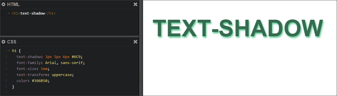 Screenshot: text with shadow, CSS
 Multiple CSS shadows for text
It is also possible to use multiple groups of values for the text-shadow property. This means that you can set multiple shadows for one text. To do this, you need to write groups of values separated by commas.
H1 ( text-shadow: 3px 5px 6px #6C9, -6px -7px 6px #D9FFA7; )
The result of applying this style is visible in the screenshot:
 Screenshot: Multiple shadows for CSS text
 You can create some really beautiful things with the CSS text-shadow property. You can experiment: set a large number of different shadows, set the color not only in hexadecimal, but also in RGBA format, using the alpha channel to adjust transparency. This is what can happen if you pay enough attention to this property:
 Screenshot: 3D text shadow in CSS
